Color is often one of the most underused and underestimated tools in office design. Compared to walls or furniture, it’s inexpensive, easy to change, and backed by research showing it can genuinely influence how people feel and perform in a space. Yet it’s often treated as an afterthought–the last decision made, once the layout and furniture are already set.
In their latest article, Steelcase breaks modern workplace needs into four categories: spaces for movement, spaces for focus, spaces for connection, and spaces for rejuvenation. Today’s offices are expected to deliver on all four, elevating offices from mere workplaces to all-encompassing spaces that can flex to support collaboration, deep focus, socialization, and even rest.
Walls and furniture help distinguish the boundaries between these spaces. Color can be used to reinforce them, giving each zone its unique identity and, when used intentionally, nudging behavior to match the space’s purpose. Explore Waldner’s breakdown of each space and the colors that shape it, and start envisioning how these principles could inform your next workplace design.
Spaces for Movement
Hybrid work has reshaped collaboration spaces: screens for virtual and in-office calls, flexible furniture, and areas for both quick huddles and scheduled meetings. The right color choices can reinforce that dynamic energy. This can be taken a step further to consider colors when designing spaces for movement and collaboration.


Yellow is linked to creativity and has been shown to facilitate open communication and collaboration, making it the perfect addition to any space for movement. When used in moderation, bright and vibrant colors including red, orange, and yellow can promote creative thinking and help foster innovative ideas. Incorporating these colors into spaces for movement can help to inspire creative problem-solving. However, designers should be careful not to overuse these bright colors, as excessive use can lead to visual fatigue and distraction. When used moderately, Work Design Magazine reported that offices incorporating vibrant colors such as orange saw a 15% boost in productivity among employees.

Some research suggests that blue supports accuracy and sustained attention. Working hand-in-hand with blue, green can improve reading comprehension and reduce eye strain. People have been shown to stay “in the zone” longer when working in cooler-toned environments, and the spaces even feel quieter as the colors encourage everyone to naturally lower their voices. Balancing cool tones with neutral tones can further help to focus attention and maintain concentration.
Spaces for Focus
As expectations for workplace design continue to go beyond simply providing spaces to work, dedicated spaces for focus in offices are crucial to provide employees with the right tools to do their most focused work. While adding spaces for collaboration, rest, and socialization, designers are sure not to forget to prioritize creating spaces for deep focus.


Spaces for Connection
With the modern-day mix of remote and in-person colleagues, designers are recognizing that it is more important than ever to provide spaces for connection and socialization. These spaces not only serve as spots to recharge socially but also to promote positive company culture.


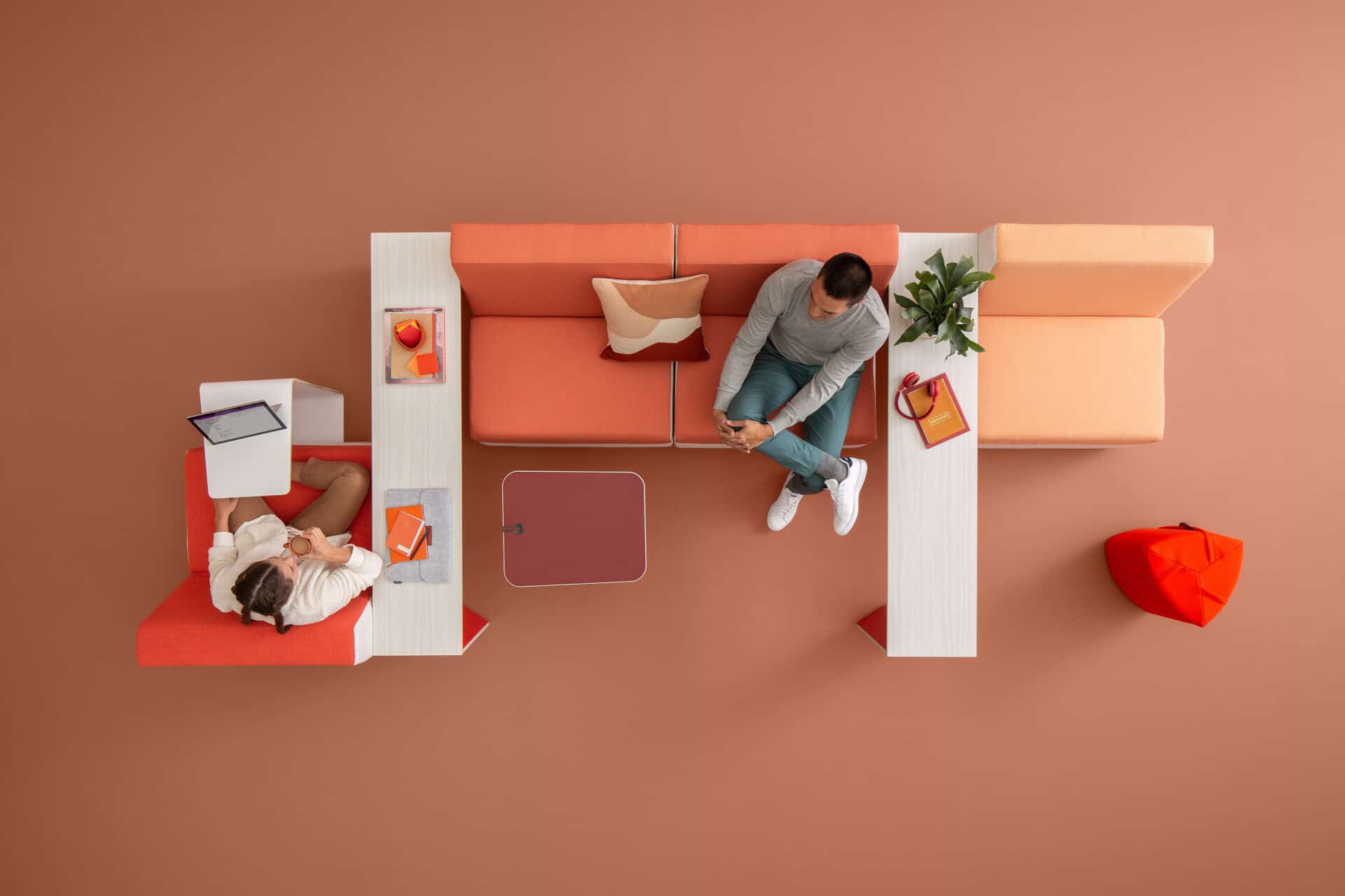
Similarly to spaces for movement, spaces dedicated to connection benefit from the presence of bright, warm colors. Warm colors such as yellow, orange, and red have been shown to evoke feelings of warmth, comfort, and happiness. Incorporating these colors into workplace design can uplift employees’ moods and encourage a positive work environment, no doubt encouraging more positive connection between employees.
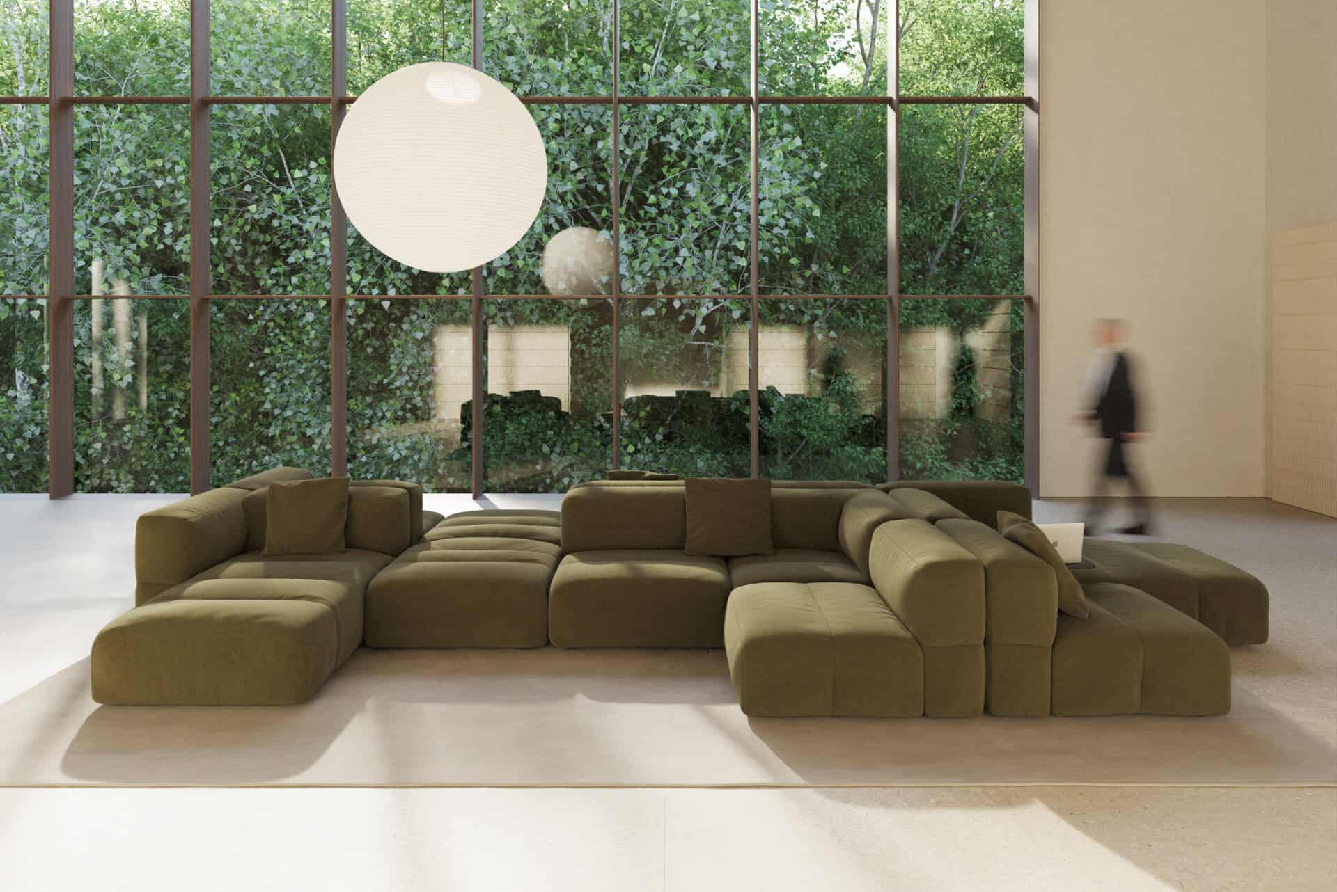
Work Design Magazine consulted research studies to see how this could be done. According to one study, employees who worked in blue and green environments reported 33% less anxiety and 25% less fatigue compared to employees working in white or grey environments. Blue not only reduces stress, but also supports mental endurance, making it the ideal color for spaces dedicated to rejuvenation and relaxation. Neutral tones are also effective in relaxing spaces as they help reduce visual overload by setting a serene, calming tone.
Spaces for Rejuvenation
In recent years, workplace design has evolved to go beyond merely supporting focused work to also make space for addressing burnout and supporting rest when needed. This can evolve even further through the consideration of colors in design for spaces dedicated to rejuvenation.

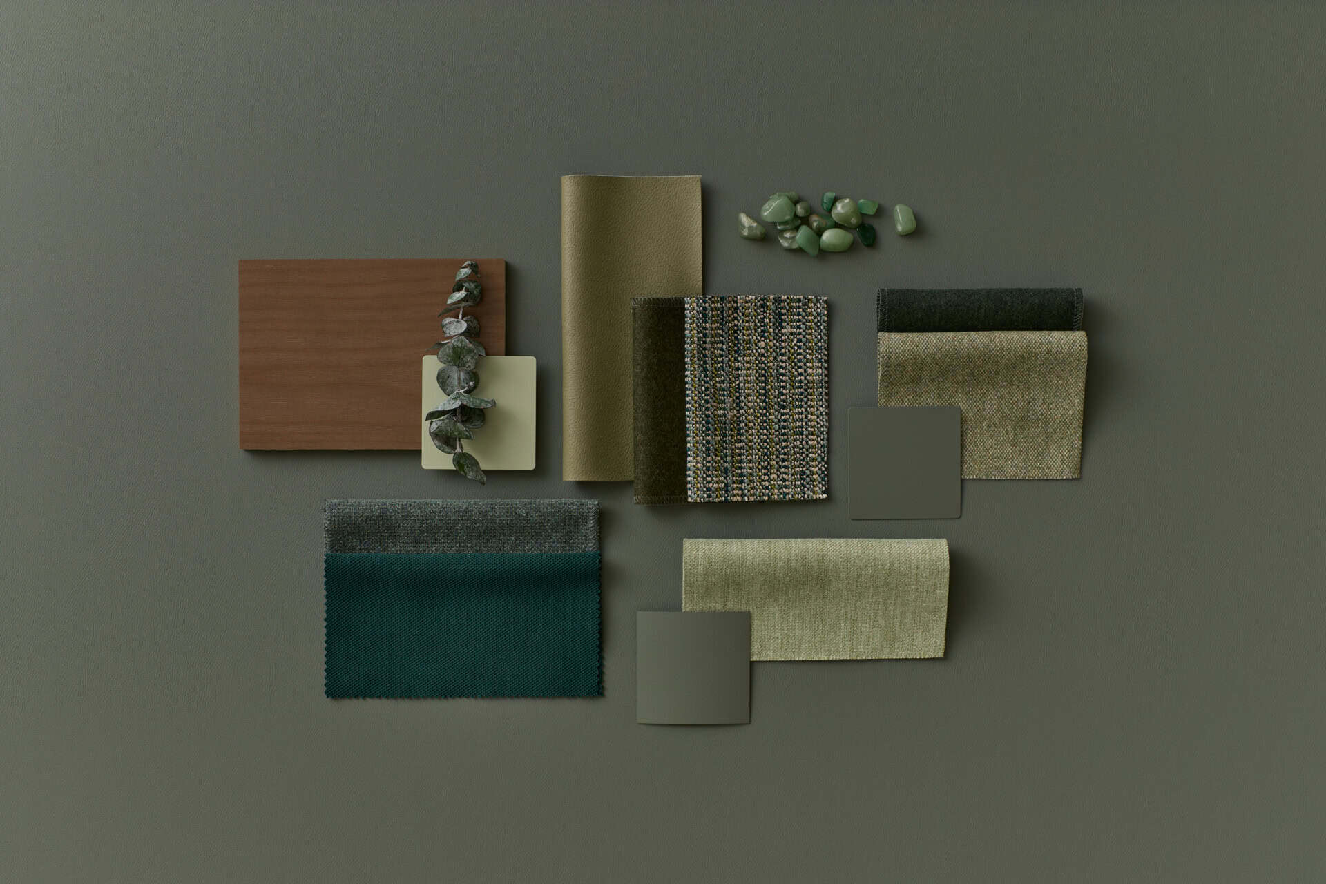
Today’s workplace is designed to do more than support productivity—it’s built to help employees work, connect, recharge, and thrive. By intentionally incorporating spaces for movement, focus, connection, and rejuvenation—and using elements like furniture, spatial boundaries, and color to distinguish their purposes—designers can create workplaces that are not only functional, but also more engaging and supportive.
Color is just one tool in the designer’s toolbox, but when thoughtfully integrated, it can help shape how a space feels and how people interact within it. The key is balance: using color to enhance the purpose of each space without overwhelming the people who use it.
Ready to put these principles into practice? Whether you’re planning a full renovation or refreshing a single zone, Waldner’s design team can help you build a color strategy that aligns with how your people actually use your space. Talk to our design team today to get started.

References:
Brain Capital & Workspace Design | Steelcase
How to Enhance the Employee Experience Post-Pandemic | Steelcase
How Color Influences Learning, Focus, and Collaboration in Educational Spaces – Design Collaborative
Color design in the age of productivity – Domus
The Best Neutral Color Palette Ideas That Are Anything but Boring | Architectural Digest